16.2
2016: Issue 2: Editorial: Goodbye 339

This issue sees the end of Free Range – it closed its doors on the 8th of August, and one of the most important spaces for emerging artists in Western Australia was gone. It is a travesty that the MRA is not desperately giving a new space to the Free Range board, but our fingers remain crossed for its future. The beauty of Free Range is that while a traditional show could be put on in its small cube space, it also allowed the most experimental shows to use it as well – I fondly remember the one-night-only series as an important part of this, that opened up a range of more experimental and leniently priced space. Not all one-night-only events are successful, but unlike Rumblestrip, it is hard to get overblown in Free Range, which maintains modesty in scale and size. Even a weeklong show is an affordable expense, and allows a great many artists access to space outside of more high-end venues.
In honour of Free Range as it was, this issue is addressed to a series of ARIs and the work within them, along with three shows at Free Range. Though it is not – as evidenced by the closure of this space – the most sustainable scene in the state, there is a gap to be filled, and ARIs are doing their best. Here’s to you, 339.
2016: Issue 2: Maria Paris and Jack Wansbrough: Trouble at times
Maria Paris and Jack Wansbrough. 2016. Trouble at times. exhibition documentation:
I close my blinds at night, so that people cannot look in to my apartment. I conversely love glancing into the windows, closed or open, of other people in the city at night. The golden glow of houses, whose occupants have returned for the night, always gives me a sense of narrative expectation: that there is something else happening, behind those blinds, and if I just stepped a little closer and peeked through them, I would find anther person’s life.

Maria Paris. 2016. I lay down to the sound of the truth. Graphite and gouache on paper. and I lay down to the sound of the wise. Graphite on paper. Photo: Guy Louden.
There are two small drawings at the back of the room that I would like to begin with. They are exceptional for their modesty. They display precise grids and circular geometric structures, interrupted by a stippling of dots and a hash of shading. They are pencil, and folded paper: the simplest of gestures to be performed on paper. They are filled with tentative marks, yet direct lines: they are vectors of uncertainty and yet are possessed by inevitability. Although they and the blinds are quite disparate, they both appear interested in depicting operations, a passage through the world that is somehow mathematical and yet totally unknowable. If they are, what are these drawings diagrams of? It would take a mathematics of feeling to know. Like Agnes Martin, there is only the logic of the spirit at work in these careful designs. Unlike Martin, there is less of an interest in perfection in these small works. The spirit is not elevated, not purified. It is perhaps a wise choice, to understand that life is messier and more complex than Martin gave it the appearance of being. Without doing as Martin did and removing yourself from life, you are left with a chaotic mechanics. It is not the mechanics of a false reality, something of a fantasy or myth like Martin’s, but diagrammatic of the world we live in. To this extent, they appear to be images of something, though they are abstract. Their motifs, like Martin’s Untitled (study for the ‘egg’), appear to refer to something else, and however spiritual it is, it is also a very real thing.
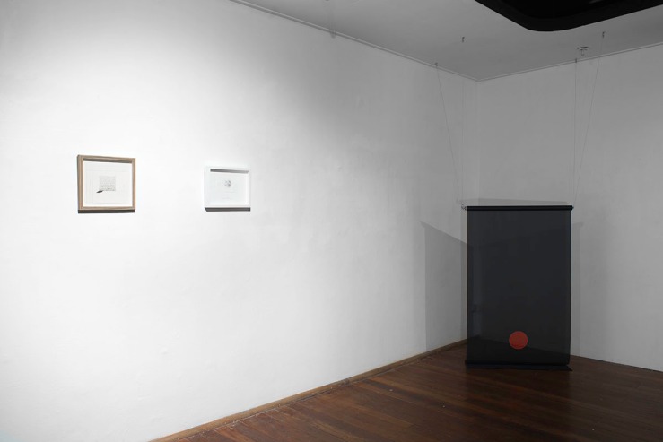
Maria Paris. 2016. I lay down to the sound of the truth and I lay down to the sound of the wise. Graphite and guache on paper and graphite on paper. Jack Wansbrough. 2016. Lars Thorwald who smokes inside with the lights off. Digital print onto polyester, RF roller blind motor, PVC. Install shot. Photo: Guy Louden
The Spanish, underneath them, reads, ‘Where to run away? You fill the world. I can only run away into you’. Though it appears bittersweet on the first read, there is something threatening in it as well. Though the sentiment of running away only into someone else appears to draw from the cliché idea about someone who is someone else’s whole world, there is something decidedly less trite about the claustrophobia and omnipresence implicated in the need to run away. The drawing above is a circular vector: is it the world? Gradually overtaken by small stabs of pencil? Are those the paths of satellites above its one-inch surface? Those eyes, always in the sky. I am inadvertently reminded of Holly Herndon’s love song to the NSA. Despite its diminutive size – or maybe because of it – there is the possibility of love and oppression being bound up in one in this small diagram: just as Herndon reminds us in ‘interface’, the personal is geopolitical.
 Jack Wansbrough. 2016. Home Semaphore. Digital print onto polyester, RF roller blind motor, PVC. Photo: Guy Louden
The blinds meanwhile hum and shudder and roll themselves up and out, furl and unfurl. They are hiding something and showing themselves simultaneously, their jarring colours overlaying the afternoon sky with yet more, less savoury hues. They are also interestingly comparable to Agnes Martin’s bands of coloured bands (such as The Wedding (idea) ). They are similarly more concerned with an external reality, and their exacting, mechanically printed bands of colour are interrupted by the passage of people on the street behind their semi-transparent fabric. The bands delimit a certain time and space as they fall and rise, and every so often, you look over your shoulder at a flash of light, you see that a lamp has been turned on by an invisible hand. Everything is automated, and like the drawings, operate like vectors in space–though this time a physical rather than imaginary one. Though not a radical intervention, they demonstrate an engagement in space, particularly the space between the out there and the in here. The blinds are designed to be malevolent, and they perform the function well – they alienate, not only through covering and revealing indiscriminately, but also by their self-empowerment. Though programmed by the artist, they rise and fall out of our own control.

Jack Wansbrough and Maria Paris. 2016. Trouble at times. Photo: Guy Louden.
These works all seem to be drawings and installations about something going on elsewhere. They never point to themselves. They remain opaque, looking and directing our attention to other things–whether they be the people on the street, or the messy personal lives we all lead. We sense that the truth is buried somewhere, but the map is indecipherable.This show gives off the same air of finding that a conspiracy is going on, but its extent and influence are totally unknown to you. As Thomas Pynchon describes, in The crying of lot 49, ‘A revelation trembled just beyond the threshold of her understanding’. You feel slightly naked, and exposed, even when the blinds are fully closed.
by Graham Mathwin
Maria Paris and Jack Wansbrough. 2016. Trouble at times. Install shot. Photo: Guy Louden.
2016: Issue 2: Claire Bushby: Asking the stones where to begin
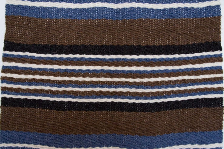
Claire Bushby. 2016. Vefa (After Halldora) 1. hand-woven Icelandic wool. Photo: Yvonne Doherty at Cirrus photogrpahy.
Claire Bushby’s show was the last show at Free Range. It featured a series of textile works, mostly weavings, and photography, that resulted from her recent residency in Iceland. The work is invested in the materiality of textiles; it uses Icelandic wool that Bushby bought from the country for this purpose. The text of Bushby’s show by Dr. Donna Franklin indicates most clearly the world from which this kind of work has come. It describes the world to be a place where the connection to the resources we use has been lost – most especially in Perth. The manner of this loss is not mentioned, but it is implied that art is a means through which we can reconnect. The form that this loss of connection takes, but that goes unmentioned in the essay, seems most probably to be the industrial process – in the essay, it takes the form of our excessive mining of natural resources. It is the industrial process though that is the form of separation that these artworks seem antagonistic to: the division of labour, the mechanization of work, and the subordination of the individual to the machine. In contrast to this, the process of hand-weaving is proposed as an activity typically full of care and attention – to the material and its origins.
The means of production of these works, though, cannot be described as a sustainable alternative–they demand consideration rather than action. It is doubtful there can be any return to a more originary relationship with an external nature that the essay seems to point to: we are after all still part of its machinations. There is no essentially moral connection to be made with anything. The moral universe is structured of human imagining, and our relationship with the environment has no essential character of sustainability or of order. The natural world is, the more we know about it and look at it, always in chaos. There is no equilibrium achievable within it. Our survival depends on certain factors within it that we could certainly be doing better to protect, but we cannot expect any re-connection with a material world that will save us from what we have done.
However, this is not a slight on the artwork, which is none-the-less very interesting. The process of weaving, especially by hand, something that could be so easily produced by machine is the first paradoxical problem, and relates to the above argument. If we take Bushby’s other projects, such as RT_Samplr as related to this work, we realise there is an ongoing narrative to do with taking highly digital (numerical, computational, abstract) forms and transforming it through the digital (dextrous, finger-based) process of weaving or cross-stitch. Weaving is a process that requires, like computer programming, everything to run according to plan. It is a sort of abstract perfection in organic material. To perform this gesture by hand might be seen as a denial of the industrial mode of production, but perhaps its absurdity is precisely the opposite of this. That it is, in fact, an obsession with the very abstract and wholly powerful ability of humanity to be like a machine, but with foresight and the ability to create. There is something potentially self-absolving about the repetitive process and abstract rules of creating with a loom; cloth was, after all, one of the first industrial (impersonal) products. Its repetitive nature gives itself easily to mechanisation.
JG Ballard, in The Atrocity Exhibition, mentions that ‘the space age lasted barely 15 years…a consequence of the public’s loss of interest – the brute force ballistic technology is basically 19th century, as people realize, while advanced late-20th-century technologies are invisible…perhaps only intelligent machines may one day grasp the joys of space travel, seeing the motion sculpture of the space flights as immense geometric symphonies’ (Ballard, 2014) Well perhaps it is not unreasonable to suggest that they may also come to take up knitting, crochet, and weaving. The process is essentially mathematical, and alterations in the code can produce extreme, extraordinary and unpredictable alterations in the character of the fabric – or can result in such deliberate and incredible processes as traditional ikat, where each individual strand is pre-dyed and then realigned and woven. These kinds of processes are suggestive of the sort of complexity and essential unknowingness that may one day be of the highest value to them.
It is similarly Bushby’s dedication to manual process that has produced these works (in particular Vefa (after Halldora) 1 &2). These designs, though, are minimal, and speak more of a history of modernism. The most impressive works in the show are almost hard-edged abstraction; their colouration and texture evoking a natural element, and the raw materials they were sourced from, while the form of the work remains wholly within the bounds of an intended, highly structured arrangement. These works are hard-edge soft abstracts, taking the kinds of strengths of Modern art through a post-minimal lens. It seems appropriate that the woven substrate that is often denied by the paintings of the abstract artists (read like this it is worth bearing in mind its implied contradiction of Greenberg’s hypothesis of painting that was supposedly moving towards the zero-point of its particularity) has become, in these works, the central feature.
The last thing I want to address is Bushby’s response to Iceland itself – or rather, contemporary art’s relationship to Iceland. It is a beautiful place, there can be no doubt, but the language that frames it in the current artistic dialogue is more like a tourist brochure than a serious investigation of what an encounter with the island is to us. Iceland, it is worth remembering, is not just the site of abounding natural beauty; it is also an interesting economic and global place. Its small community is perhaps conducive to utopian dreaming, but it is also an otherworldly place: tests for the moon landing occurred there, and it is where Jules Verne’s fictional explorers went under the surface of the earth. The landscape of the small island is however endlessly romanticised, and also its connection with the environment, upon which it is heavily reliant. No doubt Iceland’s revitalised economy and values attract many artists to its shores. It is a phenomenon that has been going on for some time. If the South of France inspired the modernists, contemporary art will be set in the Volcanic rocks and waters of this island. But do we romanticise Iceland at our own expense? With less than a quarter the population of Perth on the island, it hardly seems to warrant its strange notoriety. Perhaps Spaced 3: North by SouthWest will answer some of the questions I have about our relationship with this distant place.
Bushby’s work is a strong series though, and the relationship of textiles to contemporary art production is an important one, most especially as it is a form of art that has long languished, hidden beneath the overbearing weight of centuries of oil paint. There is, however, a strong discourse of the originary and also some kind of return that could limit its potential to transcend its status in contemporary art criticism. What I am sure of is that continued investigation will prove fruitful for the creators of textile art, as it has here, no matter what is written about them.
Ballard, J.G. 2014. The Atrocity Exhibition. 1st ed. 1969. London: Fourth Estate.
by Graham Mathwin
2016: Issue 2: David Attwood: Don’t Leave stones unturned [1]
 David Attwood
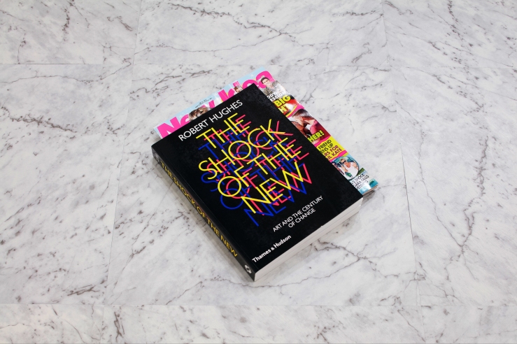
Dave Attwood. 2016. Steps. Book and magazine, faux marble vinyl tiles. 22.5 x 30 x 3cm. Photo: Robert Frith – Acorn photography.
Robert Hughes is a paradoxical character, the strange figure of an aesthete in the modern world. His distaste for contemporary art is immortalised in his later documentaries, and his distaste for Duchamp in the very tome that sits in this exhibition[1]. He was also successful in his move to television, and along with John Berger became one of the most readily accessible art critics to mass audiences. The mix of self-admitted elitism and distaste for style over passion – and his foray into mass marketability and reach – make Hughes an appropriate piece of the puzzle here; in Dave Attwood’s Don’t leave stones unturned. It is this mix of the high and low that Attwood is interested in, with a floor of false marble vinyl and the visual puns associated with the cheap magazines, art history tomes and a movie DVD case that rest upon it.
This show is extremely reduced. A simple combination of objects and installation, that is boldly put together and left with a minimum of alteration – a readymade. The principle aesthetic device at play is rare in art: humour and a pun. The initial reaction to such an absence, and such strange un-serious mechanisms seems almost always to be disappointment: that this is a joke, but one that doesn’t really land.
Perhaps the most interesting thing about this show though is not its ostensible subject, but the modes of viewership it permits. The show’s reduced nature, while simple, gives an enormous amount of empty space to its objects. The richness of this work is to be found in its ability to open pathways for our own consideration. It is the generosity of Attwood’s practice to leave things with the bare minimum of engagement, and not to overload us with things. It is extremely effective at allowing us to meditate on what we have placed before us. The first reaction is primarily disappointment, necessarily – and perhaps this initial effect will invariably render a negative initial reading – if this work were ever acceptable, it would fail to be effective. Encountering something so reduced and unaltered and mundane is typically disheartening. This invariably leads to questions and doubts, which is where the work becomes duplicitous and nearly impossible to qualify – it interrogates suppositions and biases very effectively. This insertion, of an apt object into a space that will result in the displeasure or disquiet of an audience is the legacy of the readymade as Duchamp employed it. Unlike the argument people have since sublated it to, that it was an aesthetic device, and the mundane becomes art etc. etc. Attwood seems to perceive the impetus that Duchamp himself acknowledges: that he never chose these objects as the result of ‘aesthetic delectation’ (Duchamp, Tomkins, The afternoon interviews) but instead the most disinteresting of objects, mass-produced, that add to the ‘impersonal’ nature of their selection, as Duchamp states: ‘it’s a game between the onlooker and the artist’. Though clearly Attwood’s objects are not disinterested articles of industrial production in the same way, they may as well be – they are certainly reduced to interchangeable commodities: The Shock of the New with New Idea. That they are selected, chosen, and then barely altered at all, allows them to take on the character of ideas in this game.
It is also quite funny, something I am sure Duchamp would appreciate as well. Duchamp was an advocate of humour in practice and life, and Attwood’s wry perceptions follow in this path. Humour is still not overly present in the arts, and often art takes itself too seriously – perhaps even this essay takes itself too seriously. But the arts also often fail to realise how serious humour can be. A whole domain of understanding and sensibility is therefore often locked away.
The ridiculous fact that I was standing there, in this exhibition, in a room with a few pieces of plastic and paper that I could find almost anywhere else – perhaps even a juxtaposition that could exist in any art student’s house, estranged me from the situation. This sort of game is what I imagine must occur in Attwood’s practice: that he finds ideas and plays with them for a while. A magazine folded inside The Shock of the New? I wonder if he once used New Idea as a bookmark in a very similar way, and found something in that simple gesture. There is a tendency towards the one-liner in Attwood’s works, but even with this latest body of work, it is presented with a determination that questions and interrogates – not the subject necessarily, but certainty our own prejudices. It forced a degree of self-reflection and doubt that I didn’t necessarily want, but received none-the-less. The work is ultimately beguiling because of this.
The only striking aesthetic device in the space – that remains a deadpan appropriation – is the incredible change that the flooring gives to the work. Reminiscent of the suburban character that made Suburban Similes and Monument so effective, the flooring, in its cheap commonality and faux-marble finish, give a frame to the activity that occurs on it. It takes the quality of Jarrah flooring surround it, the seriousness of a place like Moana, and plays with that very image. It is their framing on this surface that makes the art books and magazine and DVD case marry up. The ideas of cheapness, falseness, and the references to a history of cultural or material capital are all invoked in this incredibly simple reframing of the space and its contents.
The most interesting part of Attwood’s strategy is his ability to let simple ideas alone. It is this deliberate, disinterested playfulness that marks him as an inheritor of Duchamp’s legacy, which is often abused, but here deployed with the same puzzling effect. He does not attempt to put more things in the space, cram it full to the brim, he leaves us with an absence of stimulation, and we are left to our own thoughts. Attwood’s practice allows us a space in the production of his work too.
[1] It is, for those who are interested: ‘ ‘frigid people really make it’ remarked Andy Warhol…So did this frigid work of art…[The Large Glass] was also a sad machine, a testament to indifference – that state of mind of which Duchamp was the master. Indeed, his finely balanced indifference was the divide between the late machine age and the time in which we live. The large glass was very remote from the optimism that accompanied the belief that art still had the power to articulate the plenitude of life, with which greater artists but less sophisticated men than Duchamp greeted the machine in those lost days before World War I.’ (Robert Huyghes. The Shock of the New )
by Graham Mathwin
2016: Issue 2: Dave Attwood: Don’t leave stones unturned [2]
 David Attwood
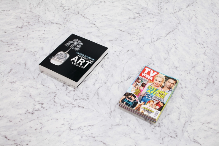
Dave Attwood. 2016. Stones. Book and stack of magazines, faux marble vinyl tiles. Photo: Robert Frith – Acorn photography
Over the last five or six years Perth based contemporary artist Dave Attwood has built an impressive and expanding body of work that looks to embody, with an eye to absolute minimalism and succinctness, the morphology of cultural idioms. Unlike the minimalists and conceptualists that inspire him, Attwood’s work functions to produce, not a purification of the material support or a distilling of the essence of an idea or concept but, instead, the minimal material embodiment of a cultural reference. In past works, Attwood has nibbled an iced VoVo into the shape of Kevin Rudd’s head—making reference to the former Prime Minister’s victory speech in 2007—exhibited unused scratchies, and stuck yogo lids to gallery walls. Such works have all embodied a certain postmodern sensibility, an interest in maintaining the precision and minimalism that characterised a great deal of modernist art whilst also casting aside notions of purity and superiority—especially when it comes to questions of art’s relations to the mundane and pejorative. In his new exhibition Don’t Leave Stones Unturned at Moana gallery in Perth, WA, Attwood turns to the very question of the legacy of postmoderism, and, in so doing, raises question about the import of this concept both artistically and philosophically.
“What comes after postmodernism?” is a question I’m commonly asked by fine art students. It’s a question I can completely understand, since, it typically comes from a place of curiosity and excitement regarding the possibility of being a part of something new and radical in the history of Western art. When students ask this question there is often a sense of expectation that I, as the “subject supposed to know”—to borrow a Lacanian formulation—should have had my ear sufficiently close to the ground to have heard the distant tremors of some impending new epoch, paradigm, or theoretical movement. There are, of course, contenders for the position of the theoretical discourse that supplants postmodernism—such as metamodernism, altermodernism, or hypermodernism—but to offer any to my students misses the opportunity to serious unpack the question, and the potentially problematic assumptions, that underpins this question.
While postmodernism can be approached as a periodising tool, a concept that helps to demarcate certain dominant shifts in political-economy and subjectivity since at least the early 1970s, we can also approach postmodernism as a philosophical and aesthetic perspective that looks to critique the production of essentialist accounts of art that are often coupled with modernist historicism. From a postmodern perspective, the often fiercely defended distinctions between pre-modern and modern, or between, say, classical and romantic, expressionist and conceptual, are to be treated with a certain incredulity or suspicion. Such a perspective would certainly not ignore the importance of historical research and consensus, but would, instead, look to challenge drawing any rigid or essentialist conclusion from such a history.
This approach to the concept of postmodernism is evident in Attwood’s latest exhibition, insofar as his minimal installation raises questions about modern art history and the periodising of art. Placed on marble veneer tiles that Attwood has used to transform the gallery floor are a scant few objects, offering the viewer what initially seems like a cold and empty space. Such objects include a copy of Robert Hughes’s The Shock of the New—modified by a copy of the popular magazine New Idea inserted like a bookmark—Sasha Grishin’s Australian Art History next to a pile of TV Weekly magazines, and, in one of the corners of the gallery, a DVD case for the 1998 drama High Art. Presenting the viewer with an immediate visual pun the objects are underpinned by flawed marble, inviting the viewer to question notions of purity and veneration. The objects themselves raise a tongue-in-cheek point of comparison between great works of art history and the now antiquated format of the television guide, with the commercial function of the latter’s categories and chronologies linked to the purportedly noble task of the art theorist or historian who demarcates epochs whilst searching for that “new idea” that will perhaps cement their name amongst the greats of the past. The question that such a juxtaposition asks is whether or not the cultural archive one is thrown into today is too eclectic and vast to be subsumed within the hierarchies and categories of historicism. Moreover, Attwood’s work makes me wonder whether or not the an affirmation of minor and marginal histories can be the only response to the vastness of the web of cultural artefacts one has access to in our present situation, and that seemingly defy scheduling and tablature.
One of they key motivations for embracing this postmodern perspective that is so well-embodied by Don’t Leave Stones Unturned is its attempt to disrupt the presumed authority of certain key figures, institutions, or concepts in order to help something novel and potentially radical to emerge. Accordingly, and I’m sure Attwood would agree, rather than simply telling my students that some ‘x’ has arrived after postmodernism, I try instead to help the students challenge the expectation that someone else will decide what is happening—that is to say, what is significant—in art so as to encourage them to think critically and for themselves about art—both art that is being currently produced and the art of the past. Such a position is perhaps initially disappointing—and might even give the impression that I am dodging a difficult question—but, hopefully, it leads to a more creative and active participation in thinking through art and aesthetics.
by Francis Russell
2016: Issue 2: Mardi Crocker: Loyalty to the thing

Mardi Crocker. 2016. Indulgent organic. Oil on board. 25 x 20 cm.
The bathroom is a paradoxical place, a reflective and glossy room that is the site of our more abject expulsions. The clean white or beige tiles and glass give the appearance of a façade, behind which hides the system to which all its orifices direct themselves. Sewerage, as Phillipe Parreno says, is how people have ‘rationalised their relationship to their waste’ (Parreno, Ulrich Obrist. 2008)and it has resulted in people redesigned cities according to plumbing needs. It is, however, the very form of the bathroom that preoccupies Mardi Crocker in Loyalty to the thing – particularly the bottles and plastic packaging that inhabit it.
Roland Barthes, in Mythologies insists on plastic as a ‘disgraced material’ in the ‘hierarchy of major poetic substances’, its ‘hollow and flat’ sound ‘best reveals it for what it is’ (Barthes, 1993). It is malleable, dissolving with heat and its absence of character allowing it to be formed in any manner, and. Vacuum cast into various shapes and figures. Yet this is the world we inhabit. Our being is itself moulded by plastics, or has plastics moulded around it (‘we are told, they are beginning to make plastic aortas’ (Barthes, 1993). But something else: René Descartes wax argument: That the only essential characteristic of bodies is their extension. That the mutability of things is the basis of their essence; unlike Barthes’ simple undermining of its character, plastic is, like wax, a soundless material (and one that fluctuates more readily than his own devotion to his certainties). Yet we know that even metal and glass melt. It is what makes them useful. Even Barthes acknowledges plastic’s quality: ‘more than a substance, plastic is the idea of its infinite transformation’ (Barthes, 1993). His denigration is unwarranted.
If I can draw a long bow: what is paint if not unformed earth? Does it not have the quality of transformation too (at least until set into its final form)? It has a character, but the character that is most conducive is its character of not yet being fixed – of its ability to become something else. There is a reciprocation between these things: That there is a constancy to the material of formlessness between plastic and paint, that yet finally fix themselves into rounded, shaped containers. What is it that these containers thus presented hold? They give the impression of being empty, holding nothing but themselves.
Robert Irwin, in Seeing is forgetting the name of the thing one sees mentions an experience that is similar to looking at Crocker’s work. He talks about the abstract expressionist obsession with ‘power’ and how to get power from a work – something that normally involves a great deal of scale – he then recalls an experience where he went to an art gallery, and was blown away, not by a grand large-scale painting, but by a small painting he saw in the corner: a Phillip Guston. The same words could be employed when looking at Crocker’s work: it is similarly diminutive in scale yet powerfully attractive. As many gaps as you can find within them, it is unimportant to their incredible qualities. Why her show was a one-night-only, and her focus on form to the elision of other pertinent issues surrounding our intimate domestic spaces remain unanswered, and perhaps never will be. One can imagine, like Giorgio Morandi, that Crocker could paint the same set of plastic tubs for the rest of her life, and still find something incredible in them.
Along with Morandi, the other most visible lineage of Crocker’s work is Vija Celmins (who was a pupil of Robert Irwin’s at one stage) – Morandi’s choice of subject appears most related to Crocker’s inquiry, but Celmins is perhaps closer to the less quantitative and more qualitative examination that Crocker puts forward of these objects. Morandi’s work sometimes seems to be merely using the cups and bowls and jugs as placeholders for something else – in his case, paint. Crocker and Celmins however, share an interest in the nature of poetic things – Celmins of photographs, Crocker of objects and the domestic space of the bathroom. Though they claelry have wildly divergent styles, Celmins and Crocker both share a certain sensitivity for the minutiae of the banal.
There is something in her work that is absent however – it is the branding and labelling that typically covers the objects of a bathroom. What does this elision mean? It clearly presents the focus as being one of form rather than the particularities of popular culture and advertising. What are the operations of something like this? It seems like a denial of the commercial in favour of the forms it has created. If Crocker’s practice looks into the overlooked, why does it in turn overlook what is an undeniable part of the object? Is it too loud? Is the branding too much an obvious part of the thing? Do we not live in a world that people are advertised to–and this is not a world with Nivea and Dove imprinted onto the bars of soap in our bathrooms? Despite this gap, the work none-the-less impresses deeply with its use of paint, its qualities, and its dedication to the most mundane of things.
Barthes, Roland. 1993. Mythologies. Translated by Annette Lavers. London: Vintage.
Descartes, René. 1960. Meditations on first philosophy. Translated by Lawrence J. Lafleur. Indianapolis, Ind : Bobbs-Merrill.
Irwin, Robert; Weschler, Lawrence. c2008. Seeing is forgetting the name of the thing one sees: over 30 years of conversations. Berkley: University of California Press.
Parreno, Phillipe; Ulrich Obrist, Hans. 2008. The conversation series: Phillipe Parreno, Hans Ulrich Obrist. Köln: Verlag der Buchhandlung Walther König.
by Graham Mathwin
2016: Issue 2: The all seeing eyes by the beige garden bed: Pet Projects
Pet projects has been presenting am eclectic mix of group shows since its inception earlier this year. Encompassing established and emerging local (and international) artists, Pet Projects seems to have had a broad premise for all its shows so far. This particular iteration features work from Lyle Branson, Sophie Durand, Jacbous Capone and Teelah George. From what can be told from its name, and the art within it, it appears to draw from the everyday as its principle subject, all the works are also based in a certain locality, or a type of place. The works in this show seem to deal with the everyday suburban or urban character of our world, a kind of quotidian space – garden beds, streets and coastal towns.
Teelah George’s paintings are mostly abstract, with hints of figuration, and are the most difficult to pinpoint to a particular location and site. The layering of paint creates a mottled surface in each. These paintings are opaque, they are grungy and dense, and painted over so much that clarity is lost in scumbled layers of pigment. We can see the layers beneath peeking through the heavy impasto of later additions. They are mysterious because of this, and the presence of dark masses in all three, gives them an ominous, portentous air. They are dense works, which weigh heavily on the walls, despite their small scale. They appear to evoke a suburban area, with the vague appearance of a Norfolk pine, but it is unclear under all the paint what they are. Whatever they might be based on, they have become impervious to our gaze, and of all the works here, they seem the most likely candidates to be gazing back.
Capone’s work was lost at the opening, but upon a second viewing the enigmatic and poetic power of the work became evident. The curious sound (that is apparently a mobile knife sharpener’s call – like a Portuguese ice-cream van for sharp blades) repeats, echoing itself, just as the screens on the wall, a sunset and sunrise turned perpendicular, echo each other and the start and end of the day. Though the logic of the work is not so clear, the sounds and images being so removed from one another as to appear to be two separate pieces, it is imbued with melancholy – the familiar feeling at the transitional points of the day. The enigmatic call of the knife sharpener’s bell compounds this strange sense. Just as the sound of the ice-cream truck playing greensleeves down the street never fails to terrify me, here the sound of the knife-cart is also – even without knowing what it is – recognisably both alien, human, and even saddening or threatening, and doubly so when you know to what it calls.
Opposite this is a puzzle, set for us by Sophie Durand, a piece that is a re-performance of history and a movie – Drift, with the famous Sam Worthington. The video of the house where Drift was set is taken from under a peppermint tree – one that similarly dangles over the coffee-table setting of the installation. The ad-hoc recording of the house seems almost like the video of a stalker, like something we are not meant to see – a world behind an illusion, yet one to which the glamour is still attached (here in the form of the audio of the film, re-recorded or with added reverb). The scripts on the table give a setting for the installation: a new house, and an ambivalence to its postmodern design, and the role of tourism and Drift in the small town of Flinder’s Bay, where the work is set. Although it appears tinged with nostalgia, with its boxy television and 70s-looking chair and table, it also engages a more complex view of the past and the present. It appears as the accumulation of narratives, a narrative knot to be untied. Though it is confusing, and requires a great deal of engagement and participation, particularly having to read the many text works, it is also extremely generous.
There are, finally, Lyle Branson’s photographs. Although installed beautifully and interestingly, they remain tied to their small, somewhat prosaic subject matter, elements and moments in the urban landscape of decay and desolation. They also inhabit the same wall as Jacqui Ball’s series of photographs from the last show, and have a similar installation strategy. Yet whereas Ball’s photos were confusing and duplicitous; too close for comfort, Branson’s are always far enough away to remain certain of what they are, and convinced of banality, and the possibility of something interesting happening within it. There are some incredible moments that have been captured. The first photo upon entering, of oil on the top of a stagnant pool, is the most affecting – a shimmering, swirling, poisonous film, that marries up with the film of the photographic paper. Yet similar to his show at Free Range, there is no distinction made between what is magical and what is uninteresting. It is true that, in his work, they are frequently the same thing. Yet it is the very detached, seemingly dispassionate air of his work, which yet seems to be invested in the most minute of sensual urban textures that appears contradictory, and perhaps gives the work the sense that it is at odds with itself. The installation however, is very impressive, the small shelves and foam-core mounting of the photographs shows them moving slowly to a sculptural form. Again, the first image beside the door demonstrates this most successfully, leaning up against the wall like a prop.
The works fit together, but have not been presented in any way that is meant to be conducive to exact, direct interpretation. There is rather a space of resonance opened up between similar practices in Western Australia. The detail and the sense of the minutiae of our everyday lives, idiosyncratic details: it is this sort of world that these works inhabit. Together, they offer a reciprocation of sensibility: much like Flaubert’s focus on the details of the life of Madame of Bovary, so here there is a focus on the details, often unnoticed, of the particularities of life in highly particular, semi-urban places.
by Graham Mathwin

Comments
Post a Comment